Simplifying Drupal with Sections & Components
Drupal has long been recognized for its powerful capabilities, but when a site isn't built with coherence in mind, it can become complicated to use, especially as new features are added over time. When each new feature introduces a new way of doing things, the result can lead to a lack of consistency in the administrative interface and make content management cumbersome. When a Drupal site is developed the right way, it remains intuitive and easy to use, regardless of how many features are added over time. That's why we developed the Sections & Components System: an intuitive approach that makes Drupal as user-friendly and accessible as popular drag-and-drop website builders, like Wix, Squarespace, and others, while still maintaining its robust flexibility and scalability for future enhancements.
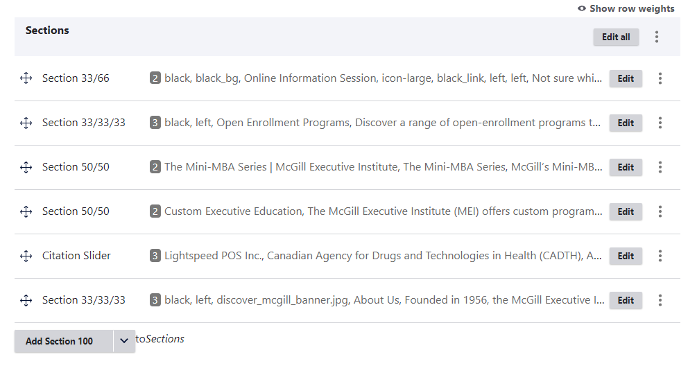
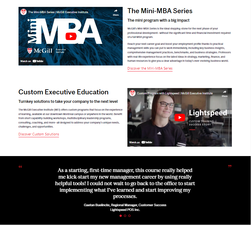
Our experience with the McGill Executive Institute exemplifies how effective this system can be. Instead of simply migrating their site from Drupal 7 to Drupal 10, we undertook a comprehensive analysis of their existing content, identifying patterns in how different types of information were being presented. This analysis allowed us to create a system that would empower their administrators to mix and match Sections & Components to build fully customised pages easily and intuitively.
We designed the system to allow users to choose from a set of predefined components such as text blocks, images, carousels, CTA buttons, and more. Site administrators can combine them in various ways to build new layouts that maintain consistency across the site. This gives our clients the ability to manage and create content with a level of flexibility and independence that wasn’t possible before. By implementing this system, administrators are now able to craft pages that meet their specific needs without being constrained by rigid templates. The result is dynamic, user-friendly websites that continue to evolve along with our clients’ needs.
At the core of this system are Sections, the building blocks of a page. Sections are predefined layout structures, typically tied to columns, that dictate how content is organised on the page. By allowing users to add, remove, and rearrange sections in the administration interface, the system enables a dynamic way of building pages without ever needing to look at code. You can easily drag and drop Sections to rearrange them as needed, creating a flow that best fits the story you're trying to tell on the page.
For example, you can create a full-width section (100%) for impactful content such as hero images or banners. Alternatively, you might opt for a two-column section (50/50), perfect for displaying text alongside complementary media. There’s also the option of three-column sections (33/33/33), ideal for evenly distributing content like service offerings or product features, and four-column sections (25/25/25/25) for more complex layouts.
Asymmetrical sections like 33/66 or 66/33 are available for situations where you want to highlight one piece of content more than the other. For example, you could place a video on the larger column (66%) and supporting text on the smaller column (33%), giving users a more dynamic way to digest your content. This versatility in layout proportions allows for a wide range of design possibilities that can suit different types of content.
In addition to flexible layouts, Sections can also serve specific, functional roles. For instance, a section can be designed specifically for FAQs using accordion-style dropdowns, which make it easy for users to navigate through content without feeling overwhelmed. You could also include a carousel slider section, perfect for showcasing multiple images or pieces of content in a rotating manner, saving space while maintaining engagement.
Symmetric, asymmetrical and specific Sections are all fully responsive, automatically adapting to different screen sizes by stacking content appropriately on smaller devices, all while maintaining accessibility standards. This ensures that your site remains visually cohesive and accessible, whether viewed on a desktop, laptop, tablet, or mobile device.
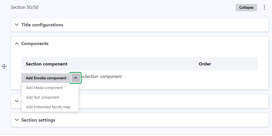
Within each section, you can add Components, the content elements that populate your page. Components might include text blocks, images, carousels, or any other type of content you need. The beauty of the system is its modularity, allowing you to place and rearrange these elements in ways that best suit your goals. Whether you're aiming for a clean, minimalistic design or a rich, media-heavy page, Components give you the flexibility to adapt and scale your content with ease.
For instance, in a two-column (50/50) section, you might place a text block on one side and an image on the other. Or, in a full-width (100%) section, you might feature a large title with call-to-action buttons aligned in the centre. This flexibility allows for creativity and customization while maintaining consistency across the site.
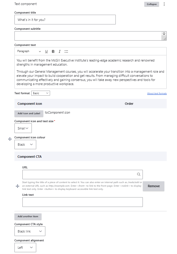
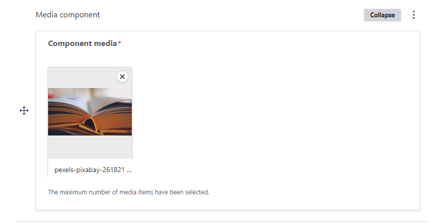

Each element within a Component is highly customizable. For example, you can adjust typography, colour schemes, and alignment according to your brand guidelines. Images and carousels are configured to maintain visual consistency across the site, ensuring your design is cohesive. Additionally, interactive elements like call-to-action (CTA) buttons and background colours are adjustable, offering a preset of colours and alignments defined by the site-builders.
But it doesn’t stop there, components are tailored to meet accessibility standards (such as WCAG compliance), ensuring your content is easily navigable for all users. This means that content editors can confidently create and manage their pages knowing that the Components are designed to automatically meet accessibility standard requirements. Whether you're adding videos, forms, or data tables, the system guarantees both aesthetic and functional coherence across all generated content on the website. This assurance extends to dynamic content Components like integrated forms for lead generation, embedded social media feeds, and third-party tool integrations.
Ultimately, the flexibility of Components allows you to mix and match various content elements within any section, creating unique layouts that fit your specific needs while maintaining a consistent and professional look across the site while respecting accessibility standards.
Sections & Components can provide the structure and flexibility you need to create a professional, well-organised website. With the right approach, Drupal can be the ideal platform for any project, delivering both simplicity and power in equal measure.
If you’re ready to explore how Sections & Components can enhance your Drupal site, we’re here to help. Contact us today to discuss how we can bring your vision to life!


